Quick Guide on Flexbox💪💪

I am a software developer as well as a mentor. Teaching is my hobby and coding is my passion. Working on various technologies related to web development.
Developed interest and started writing blogs.
Hola Coders!
In this article, we will learn about flexbox in CSS. It is a very easy to learn property of CSS. You will love the flexbox and want to implement it in next CSS styling work.
Now let's start the coding 🙋♀️
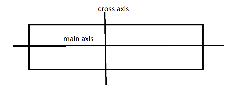
Axis in Flexbox
Flexbox contains two axis 👇
- main axis
- cross axis
main axis
It is the axis in which the items are laid out. It depends on the flex-direction. If flex-direction is row than main-axis is horizontal else if it is column then main axis is vertical
cross axis
The Cross axis is perpendicular to the main axis. The direction of the cross axis depends on the main axis.
By default flex-direction is row
flex-direction
This property specifies the direction of elements in the container and tells the main axis. Values in flex-direction 👇
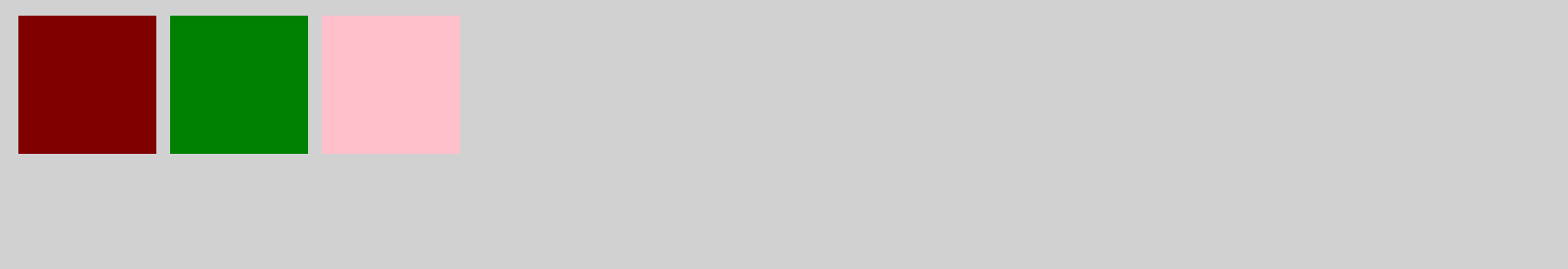
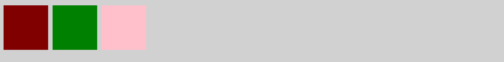
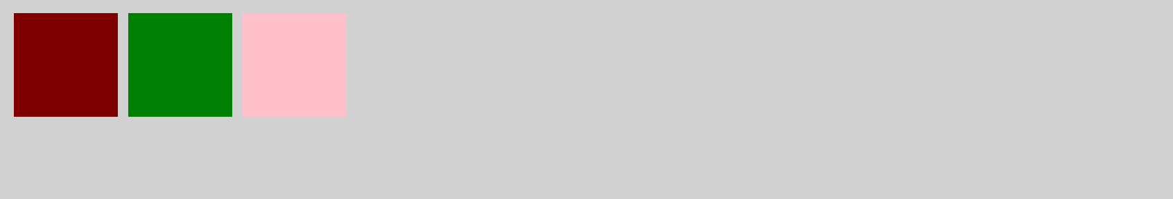
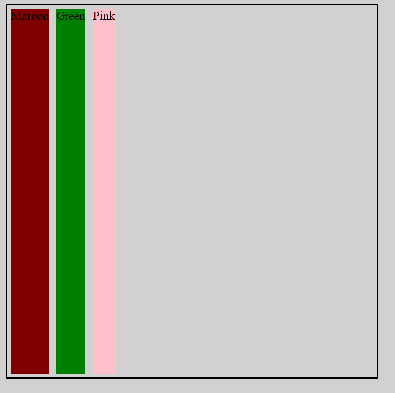
- row: It will have main axis from left to right.
Let's write for all flex-direction
<body>
    <div class="container">
        <div class="maroon"></div>
        <div class="green"></div>
        <div class="pink"></div>
    </div>
</body>
/* general css */
body{
  background-color: #d1d1d1;
}

.green {
  background-color: green;
  width: 100px;
  height: 100px;
  margin: 5px;;
}
.pink {
  background-color: pink;
  width: 100px;
  height: 100px;
  margin: 5px;
}
.maroon {
  background-color: maroon;
  width: 100px;
  height: 100px;
  margin: 5px;
}

/* flex property */
.container {
  display: flex;
  flex-direction: row;
}
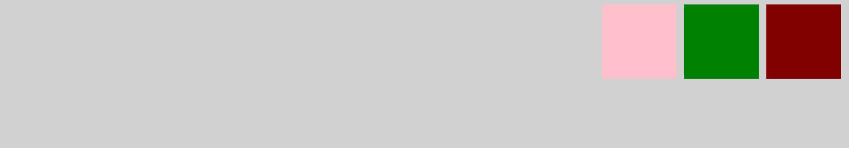
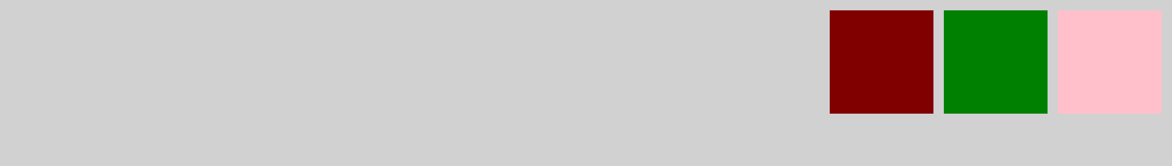
- row-reverse: It will contain main axis from right to left.
/* flex property */
.container {
  display: flex;
  flex-direction: row-reverse;
}
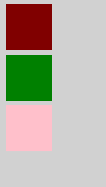
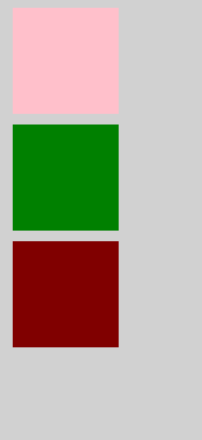
- column: It will contain main axis from top to bottom.
/* flex property */
.container {
  display: flex;
  flex-direction: column;
}
- column-reverse: It will contain main axis from bottom to top.
/* flex property */
.container {
  display: flex;
  flex-direction: column-reverse;
}
justify content
Once the axis of the container is set then , justify-content helps in aligning the items. Values of justify-content 👇
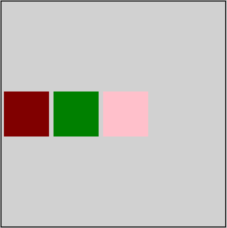
- flex-start: Items align to the left side of the container.
/* flex property */
.container {
display: flex;
flex-direction: row;
justify-content: flex-start;
}
- flex-end: Items align to the right side of the container.
/* flex property */
.container {
display: flex;
flex-direction: row;
justify-content: flex-end;
}
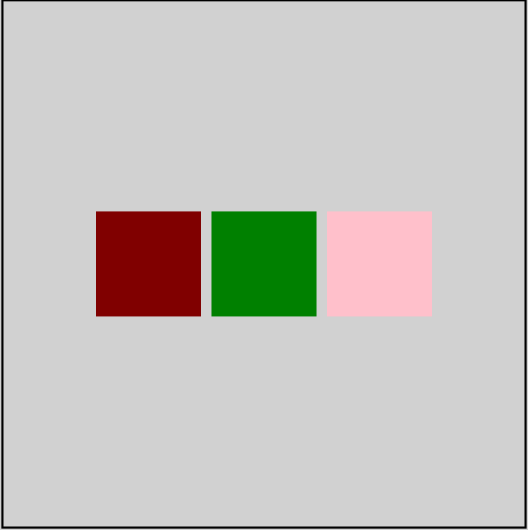
- center: Items align at the center of the container.
/* flex property */
.container {
display: flex;
flex-direction: row;
justify-content: center;
}

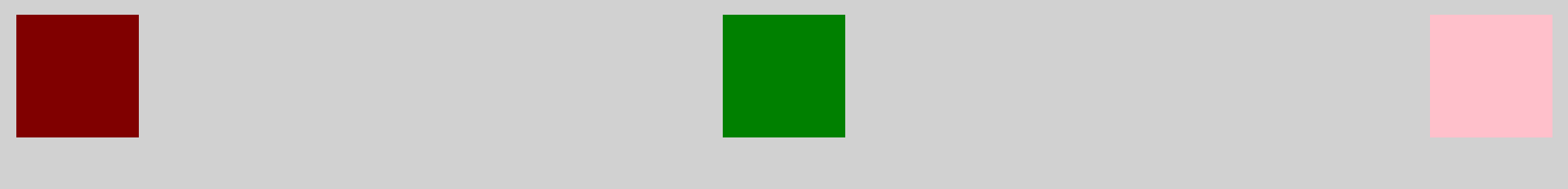
- space-between: Items display with equal spacing between them.
/* flex property */
.container {
  display: flex;
  flex-direction: row;
  justify-content: space-between;
}
- space-around: Items display with equal spacing around them.
/* flex property */
.container {
display: flex;
flex-direction: row;
justify-content: space-around;
}

align items
align-items aligns the items of the container in cross axis. Values of align-items 👇
Note: height of container is required to apply align-items property
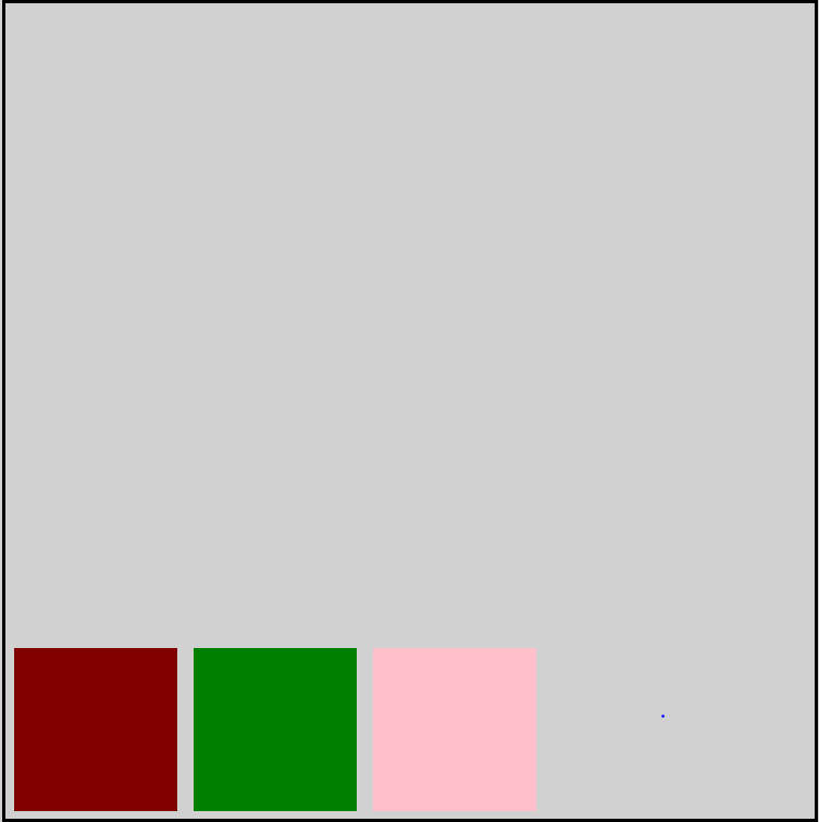
- flex-start: Items align to the top of the container.
/* flex property */
.container {
height: 500px;
display: flex;
flex-direction: row;
align-items: flex-start;
}
- flex-end: Items align to the bottom of the container.
/* flex property */
.container {
  height: 500px;
  display: flex;
  flex-direction: row;
  align-items: flex-end;
  border : 2px black solid
}
center: Items align at the vertical center of the container.
/* flex property */
.container {
  height: 500px;
  display: flex;
  flex-direction: row;
  align-items: center
  border : 2px black solid
}
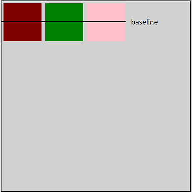
- baseline: Items display at the baseline of the container. Baseline off all the items align.
/* flex property */
.container {
  height: 500px;
  display: flex;
  flex-direction: row;
  align-items: baseline;
  border : 2px black solid
}
stretch: Items are stretched to fit the container.
/* general css */

.green {
  background-color: green;
  margin: 5px;;
}
.pink {
  background-color: pink;
  margin: 5px;
}
.maroon {
  background-color: maroon;
  margin: 5px;
  align-items: stretch;
}

/* flex property */
.container {
  height: 500px;
  display: flex;
  flex-direction: row;
  align-items: stretch;
  border : 2px black solid
}
for the above👆 examples we assume the main axis is from left to right.
Let's apply multiple properties together
Centering the elements
/* flex property */
.container {
  height: 500px;
  display: flex;
  flex-direction: row;
  /* centers at main axis */
  justify-content: center;
  /* centers at cross axis */
  align-items: center;
  border : 2px black solid
}
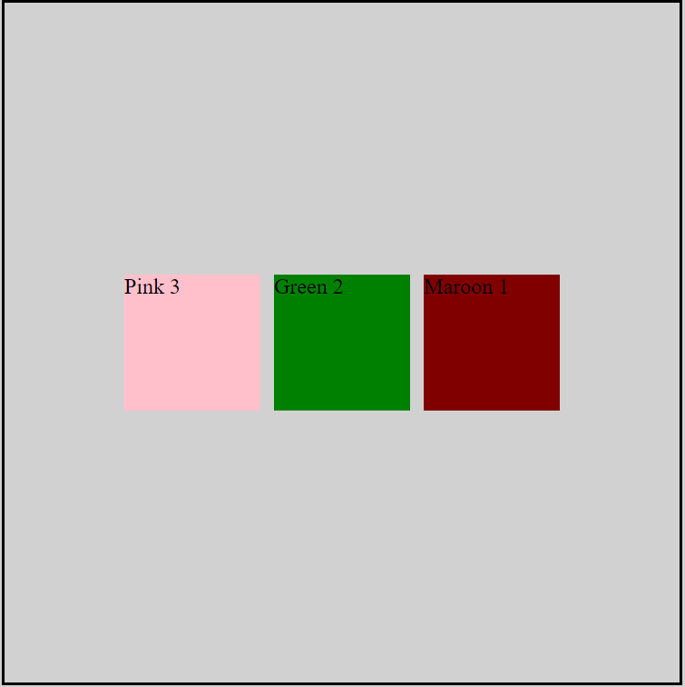
order
order helps in reordering the elements in the container as per the requirement. It works on the basis of priority, highest order number element will be place at the end.
.green {
  background-color: green;
  width: 100px;
  height: 100px;
  margin: 5px;
  /* order */
  order : 1;
}
.pink {
  background-color: pink;
  width: 100px;
  height: 100px;
  margin: 5px;
  /* order */
  order: 0
}
.maroon {
  background-color: maroon;
  width: 100px;
  height: 100px;
  margin: 5px;
  /* order */
  order: 3
}

/* flex property */
.container {
  height: 500px;
  display: flex;
  flex-direction: row;
  justify-content: center;
  align-items: center;
  border : 2px black solid
}
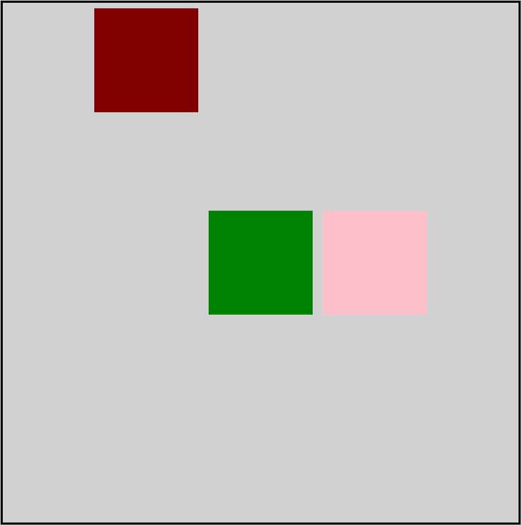
align self
align-self property values are similar to align-items with a slight change that align-self property works on the individual element.
.maroon {
  background-color: maroon;
  width: 100px;
  height: 100px;
  margin: 5px;
  /* applying align-self */
  align-self: flex-start;
}

/* flex property */
.container {
  height: 500px;
  display: flex;
  flex-direction: row;
  justify-content: center;
  align-items: center;
  border : 2px black solid
}
flex wrap
flex-wrap comes into the picture when elements do not align in a single row. When elements shrink within the container, flex-wrap spreads out the container. Values for the flex-wrap 👇
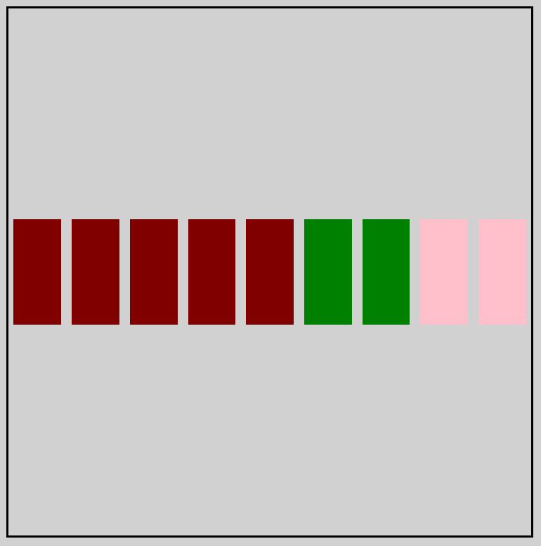
- nowrap: Every item is fit to a single line.
By default flex-wrap property is nowrap
HTML
    <div class="container">
        <div class="maroon"></div>
        <div class="maroon"></div>
        <div class="maroon"></div>
        <div class="maroon"></div>
        <div class="maroon"></div>
        <div class="green"></div>
        <div class="green"></div>
        <div class="pink"></div>
        <div class="pink"></div>
    </div>
CSS
.green {
  background-color: green;
  width: 100px;
  height: 100px;
  margin: 5px;
}
.pink {
  background-color: pink;
  width: 100px;
  height: 100px;
  margin: 5px;
}
.maroon {
  background-color: maroon;
  width: 100px;
  height: 100px;
  margin: 5px;
}

/* flex property */
.container {
  height: 500px;
  display: flex;
  flex-direction: row;
  justify-content: center;
  align-items: center;
  border : 2px black solid;
  /* flex-wrap */
  flex-wrap: nowrap;
}
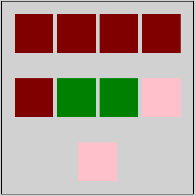
- wrap: Items wrap around to additional lines.
/* flex property */
.container {
  height: 500px;
  display: flex;
  flex-direction: row;
  justify-content: center;
  align-items: center;
  border : 2px black solid;
  /* flex-wrap */
  flex-wrap: wrap;
}
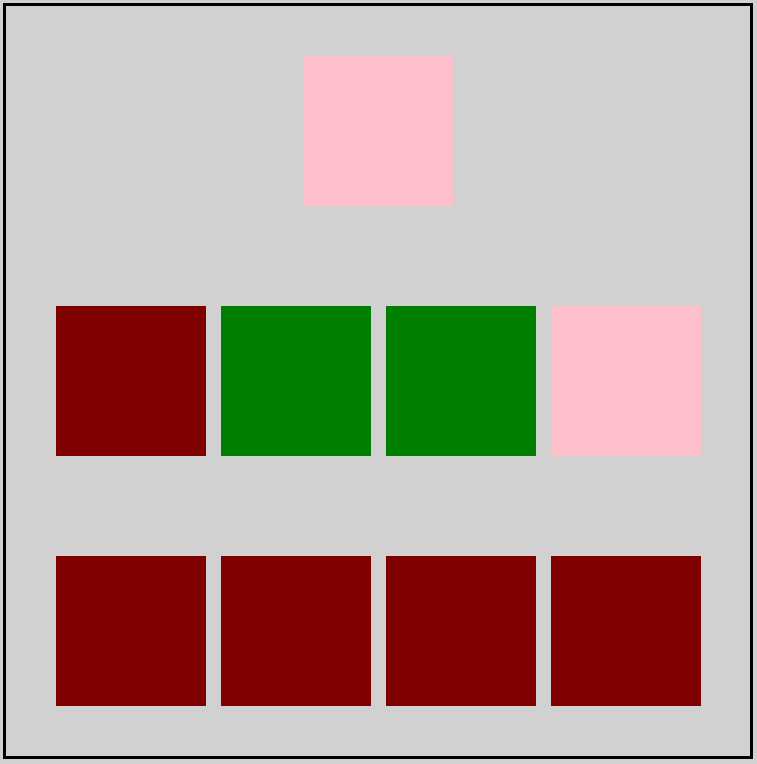
- wrap-reverse: Items wrap around to additional lines in reverse.
/* flex property */
.container {
height: 500px;
display: flex;
flex-direction: row;
justify-content: center;
align-items: center;
border : 2px black solid;
/* flex-wrap */
flex-wrap: wrap-reverse;
}
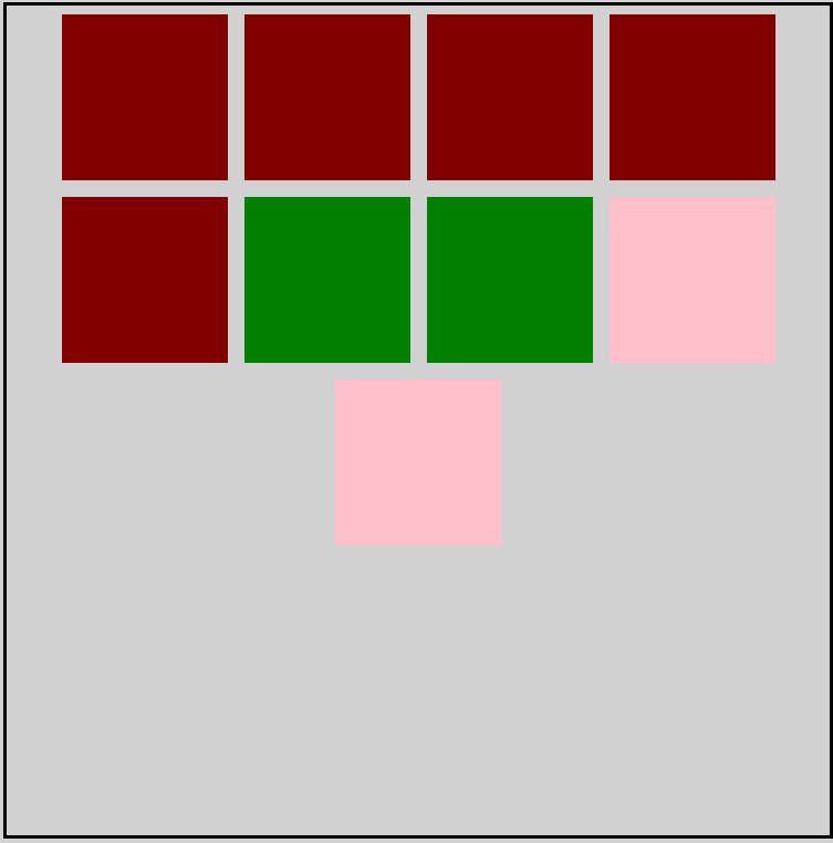
flex flow
flex-flow is the shorthand notation for flex-direction and flex-wrap .
/* flex property */
.container {
  height: 500px;
  display: flex;
  justify-content: center;
  align-items: center;
  border : 2px black solid;
  /*
  flex-direction : column;
  flex-wrap : wrap;
  */
  flex-flow : column wrap;
}

align content
align-content helps in spacing multiple lines or can say it sets the space between multiple lines.
This can be confusing, but align-content determines the spacing between lines, while align-items determines how the items as a whole are aligned within the container. When there is only one line, align-content has no effect.
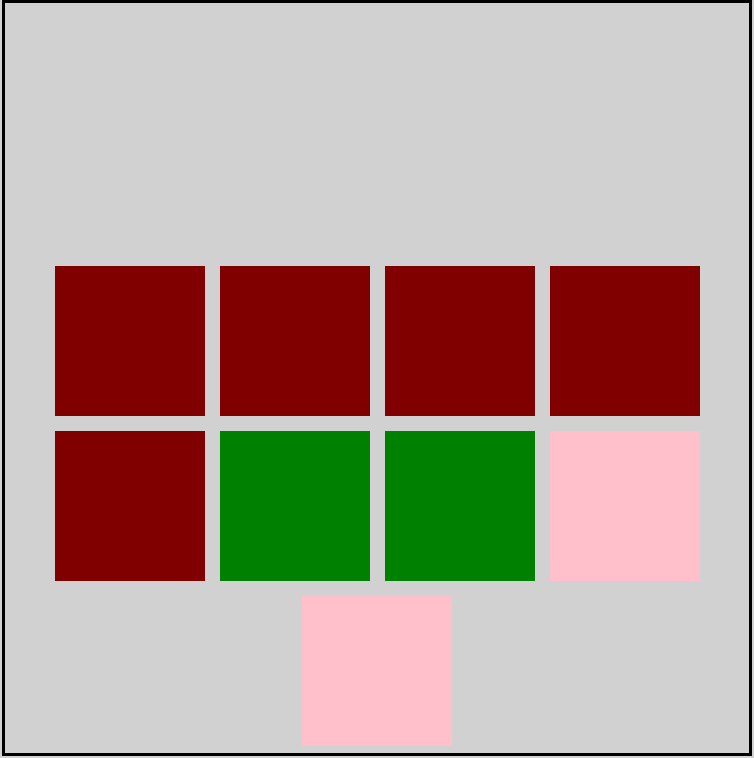
- flex-start: Lines are packed at the top of the container.
/* flex property */
.container {
height: 500px;
display: flex;
justify-content: center;
align-items: center;
border : 2px black solid;
flex-flow : row wrap;
align-content: flex-start;
}
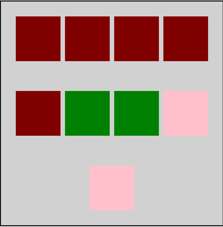
- flex-end: Lines are packed at the bottom of the container.
/* flex property */
.container {
  height: 500px;
  display: flex;
  justify-content: center;
  align-items: center;
  border : 2px black solid;
  flex-flow : row wrap;
  align-content: flex-end;
}
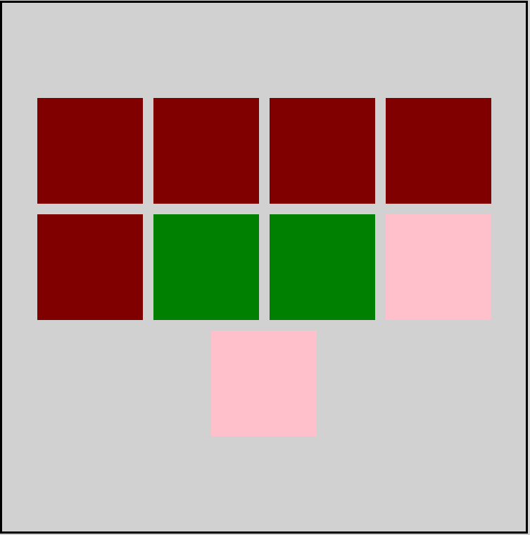
- center: Lines are packed at the vertical center of the container.
/* flex property */
.container {
height: 500px;
display: flex;
justify-content: center;
align-items: center;
border : 2px black solid;
flex-flow : row wrap;
align-content: center;
}
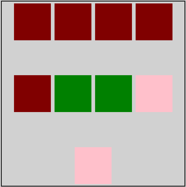
- space-between: Lines display with equal spacing between them.
/* flex property */
.container {
  height: 500px;
  display: flex;
  justify-content: center;
  align-items: center;
  border : 2px black solid;
  flex-flow : row wrap;
  align-content: space-between;
}
- space-around: Lines display with equal spacing around them.
/* flex property */
.container {
  height: 500px;
  display: flex;
  justify-content: center;
  align-items: center;
  border : 2px black solid;
  flex-flow: row wrap;
  align-content: space-around;
}
Here is an interesting game to learn flexbox. Flexbox froggy game
The End
I hope you enjoyed the article and had a good learning experience.
Follow for more articles and keep sharing👩
Keep coding


